The “No-Logo” Ad Creative Playbook: How to Look Pro Without Breaking Policy
If your ads feel cluttered or keep getting ignored, simplify. Here’s a no-logo creative playbook with proof-first visuals that look pro and convert.


If you’ve ever boosted a post or launched an ad and thought, “Why does this look messy?” you’re not alone.
A lot of small businesses default to:
- slapping a big logo on the image
- adding paragraphs of text
- cramming in phone numbers, services, prices, and a CTA
It feels “complete,” but it usually does two bad things:
- It makes the ad harder to understand in one second
- It makes people scroll past it faster
The fix is surprisingly simple:
Make the visual do one job, and let the caption do the talking.
Here’s the no-logo creative playbook that keeps things clean, professional, and conversion-friendly.
Why “no-logo” often performs better
This isn’t about hating your brand.
It’s about how people actually scroll:
- they notice a clear image first
- they decide if it’s relevant fast
- then they read (if you earned the read)
A giant logo doesn’t help them decide. Proof does.
And in many cases, logos and heavy text just add clutter, especially on mobile.
The rule of thumb
Your image should communicate the “what,” your caption should communicate the “why” and “what next.”
Image = proof, process, outcome
Caption = context, trust, CTA
The 5 no-logo visuals that convert best for small businesses
1) Before/after (fastest trust builder)
This is the easiest “proof-first” visual.
- left: problem
- right: fixed
- no extra text needed
Works great for:
- trades
- home services
- websites/SEO (speed, rankings, visibility screenshots)
- cleanup/restoration type services
2) “Hands doing the work” (process proof)
This is for businesses that don’t have perfect before/after shots.
Show:
- your hands, tools, equipment
- a simple step in your process
- the “real work” moment
People trust what looks real.
3) The “result artifact”
Show the thing your customer gets:
- a printed estimate sheet (blur personal info)
- a clean inspection report cover page
- a “work completed” checklist
- a dashboard snapshot (blur sensitive data)
It signals: “This is a real business with a real process.”
4) Environment and credibility shots
Photos that quietly say “we exist and we’re legit”:
- your team (casual, not stock-photo stiff)
- your truck/van at a job site
- your workspace (clean)
- your equipment laid out
These are especially helpful for service-area businesses and solopreneurs.
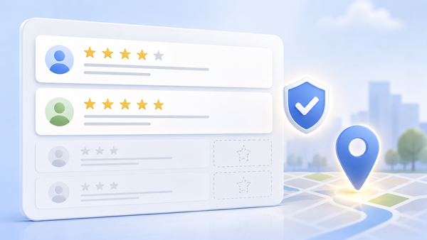
5) Simple “proof tiles” (without logos)
Instead of logos, use proof icons:
- stars (rating vibe)
- shield (trust)
- map pin (local)
- calendar/check (booked)
Keep it minimal. Let it support the image, not dominate it.
The 3 “creative angles” to rotate (ties into ad fatigue)
Use the same offer, but rotate these angles so ads don’t die after two weeks:
- Proof: before/after, testimonial-style visual, results
- Teach: one tip shown visually (tool, quick demo, checklist vibe)
- Offer: clean visual + strong caption CTA
This keeps performance steady without constantly reinventing your whole campaign.
The simple creative rules that make you look pro
Use these and your ads will instantly feel cleaner:
- One subject per image (one focus, not a collage)
- High contrast (subject stands out)
- Good lighting (natural light beats dim office photos)
- No tiny details (mobile users won’t see them)
- Avoid busy backgrounds (less visual noise)
- Leave negative space (lets the eye rest)
What to avoid (the usual conversion killers)
- Too much text on the image
- Tiny bullet lists nobody can read
- Multiple CTAs (call, text, email, book, visit site… all at once)
- Stock photos that look fake
- “Generic promo” graphics that look like every other business
If it looks like an ad before it looks like proof, performance usually suffers.
The easiest workflow for tiny teams
Here’s a fast weekly workflow that doesn’t require being a designer:
- Pick one offer for the week
- Create 3 visuals (proof, teach, offer)
- Write 3 captions (short hook, value, CTA)
- Schedule them (Metricool makes this easy)
- Refresh one visual weekly to avoid fatigue
That’s it.
The bottom line
You don’t need louder ads. You need clearer ads.
A no-logo, proof-first approach helps you:
- look more professional
- stop cluttering the message
- convert better on mobile
- rotate creative easily without burnout
Need help building ad creative that looks clean and converts, while supporting your small business SEO long-term? Managed Nerds can help you tighten your messaging, improve landing pages, and create a repeatable content and ad system that drives calls and bookings, not just clicks.
Thank you for reading. If you’d like more small business SEO tips, subscribe for updates.